I’ve been teaching science for nearly 20 years and specializing in environmental science education since 2009. My website, www.mrkremerscience.com, is one of Google’s top search results for the IB Environmental Systems and Societies course.
The high school students I teach come into my course with a broad range of environmental knowledge and enthusiasm. Some enroll because they’re already keenly aware of environmental issues and want to learn more as they prepare for possible entry into environmental fields of study at university. Others sign up simply because they think it will be an easier grade than chemistry or physics (it’s not).
One thing many of them have in common is what I’ll refer to as data illiteracy – a poor capacity to analyse and interpret data. They can generally describe broad trends, such as change over time, or identify minimum and maximum values in a graph, especially if the data comes from a controlled lab experiment. But frequently, students new to my class struggle to infer the broader meaning of scientific information in a real-world context.
Understanding the meaning of data – what it can tell us about the world we live in and our impact on people and the planet – is an essential component of critical thinking that transcends any single field of knowledge and is applicable to practically every profession.
So how do we effectively teach authentic, durable data literacy to young people? Expose them to as much real-world data as possible and require them to make sense of it.
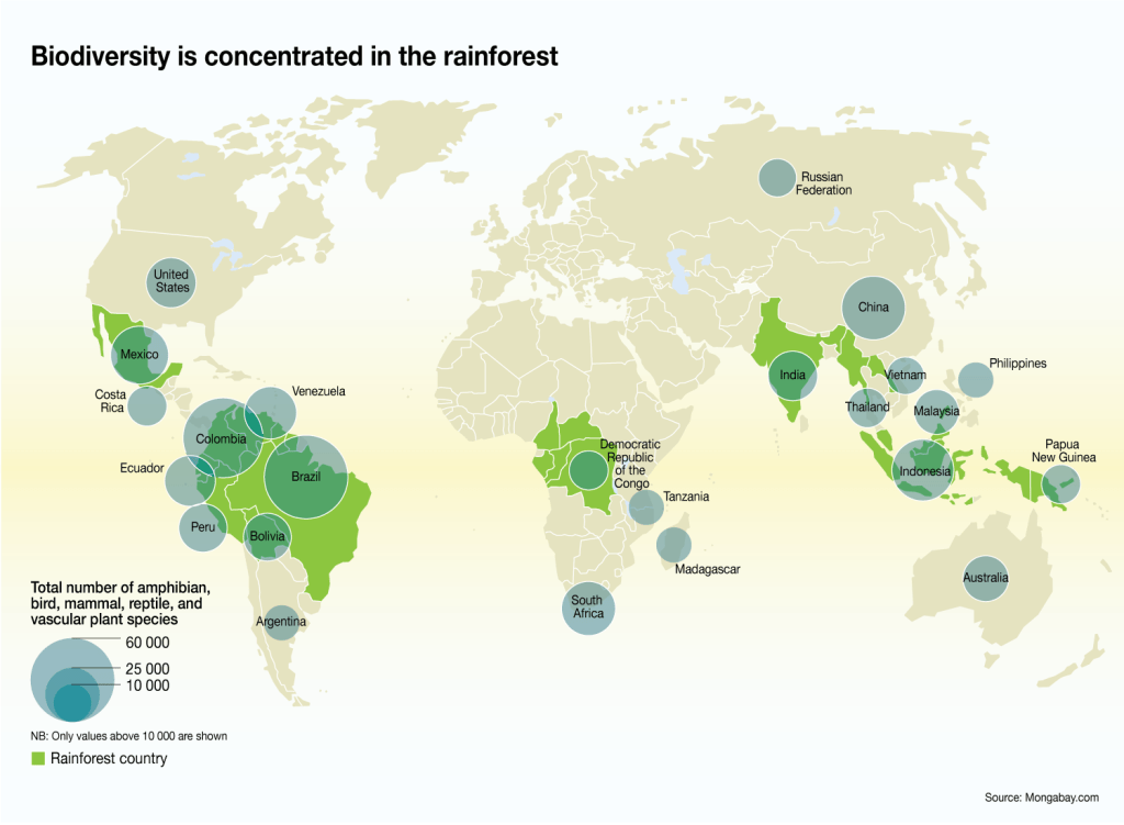
One of the best resources I’ve found for reliable data and infographics about our world is the UNEP’s GRID-Arendal graphics collection. GRID-Arendal’s graphics are free for attributed use, searchable by keyword or geographic location, and they’re available at a range of resolutions for digital and print publications. They also address an astounding number of topics:
- Want some visual data about climate change? Here are 266 free climate change infographics for use in your class.
- How about water? A library of 1200 infographics at your fingertips.
- Are your students curious about biodiversity loss and conservation? Direct them to this collection.
- Teaching about soils and food production? Try these soil graphics or this collection of food production graphics.
- Do you live in Cambodia? or Tanzania? Madagascar? Brazil? Curate visual, user-friendly, reliable data for your locale with a few keystrokes.
Ditch the textbooks. Begin lessons with some graphic data. Challenge students to explain what they see. One or two ‘why’ questions will spawn one or two more, and before you know it, you’ll have genuine inquiry happening.

You must be logged in to post a comment.